OKLCH for better color in the browser
Why I’ll (probably) never use hex colors in CSS again, and what I’m doing instead. With visual examples!
Something that has always bugged me about CSS is the dullness of most gradients.
You’d have this beautiful idea for your design, set up the gradient in your CSS, and when it rendered in the browser it was just… blech.
The middle gets all muddy and the whole thing just feels kinda flat and lifeless.
But watch what happens when you do the exact same gradient, but in the OKLCH color space, which I learned was available to use from Chris Coyier’s post crowning OKLCH as the “winner” for color in CSS:
Now that looks great!
So… what exactly is happening here, and why does OKLCH make such a big difference?
I am not the expert here
Before I start explaining anything: I’m not an expert in this stuff. I read a bunch of material written by actual experts, and I’m collecting what I learned here in hopes that some of the knowledge gets caught in my brain wrinkles along the way.
If you want to read the experts, check out the links and resources at the end of this post.
What the heck is a color space?
There’s an entire field of study behind color spaces, so let me gloss over most of it and say: color spaces are the math computers use to turn stuff like rgb(100 200 0 / 0.5) into color on the screen.
The default browser color space, sRGB, is called a rectangular color space. In addition to srgb, browsers also support rectangular color spaces srgb-linear, lab, oklab, xyz, xyz-d50, and xyz-d65.
OKLCH, however, is a polar color space. The browser can support several polar color spaces: hsl, hwb, lch, and oklch.
What does color space change how gradients look?
From what I understand, the reason gradients look so much better in OKLCH is that rectangular color spaces draw a straight line through the color space between the gradient colors, where polar color spaces draw an arc through the hues to get there.
That’s why the same gradient looks muddy in srgb and looks great in oklch. To (very roughly) visualize what’s happening with a gradient, take a look at the lines drawn between the two colors from our gradients above:

So in a rectangular color space, the interpolation takes the middle colors from the muddy middle of the color wheel, which Adam Argyle lovingly calls “the dead zone” in this article that has more information about color than anyone could ask for.
In a polar color space the arc keeps the gradient along the hues at roughly the same distance from the “center” (again: lots of math happening here that I’m skimming past).
OKLCH is good for more than just gradients, though
On top of making gradients look actually good, OKLCH moves us into a color space that literally has more colors in it. sRGB is limited because when it was defined, monitors couldn’t display all the colors it defined. These days, though, we’re getting HDR monitors that support nearly double the colors, and OKLCH lets us start using them.

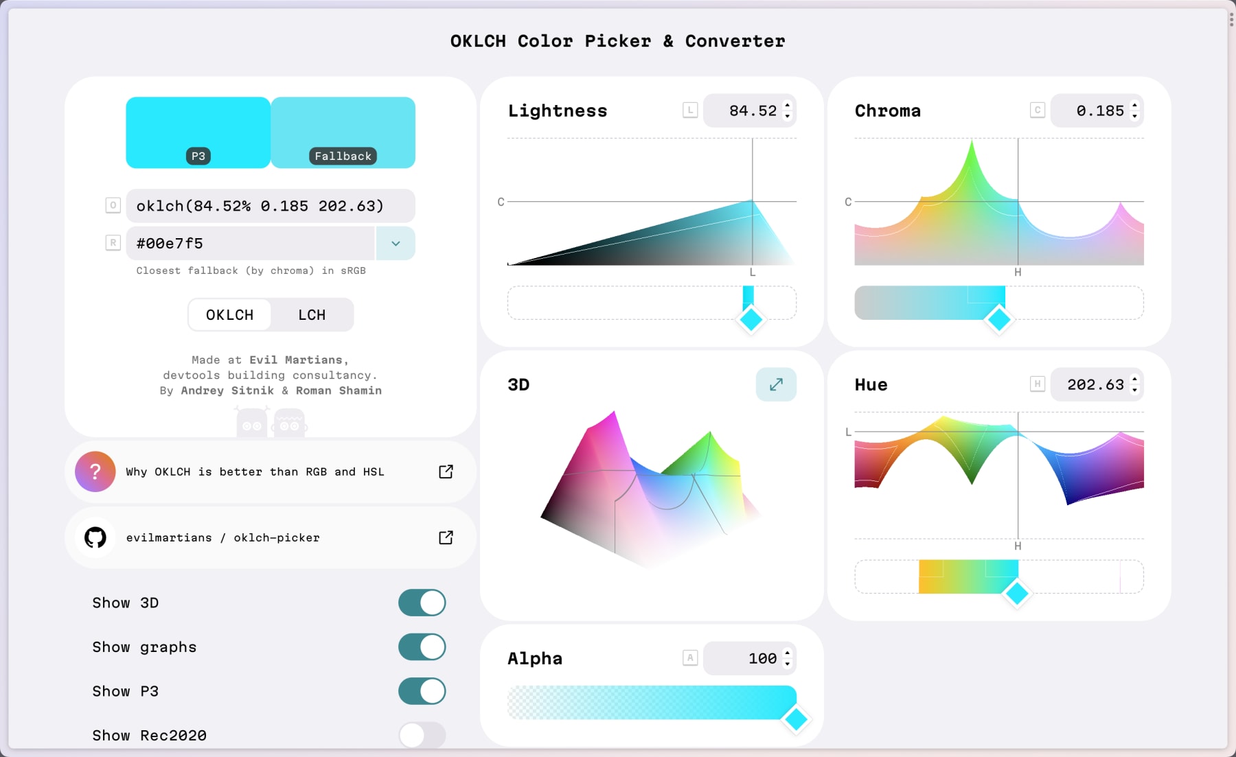
The short version is that if we switch to OKLCH, we get a larger palette of brighter, more vivid colors. You can see the extra colors visualized in Evil Martian’s OKLCH color picker (note the difference between the selected color and the fallback).
The long version is far better explained in Lea Verou’s post on LCH in CSS.
See the OKLCH difference for yourself
I threw together a quick CodePen showing how a gradient looks in all the different color spaces. Edit this to change out the colors and see how each color space handles it.
See the Pen Visualizing all CSS color-interpolation-methods in gradients by Jason Lengstorf (@jlengstorf) on CodePen.
I’ll let you draw your own conclusions since this all comes down to preference, but for me, OKLCH will be my new default choice for colors in the browser.